
Sunday, May 22, 2011
Magazine cover
Saturday, May 21, 2011
Masking Technique

Friday, May 20, 2011
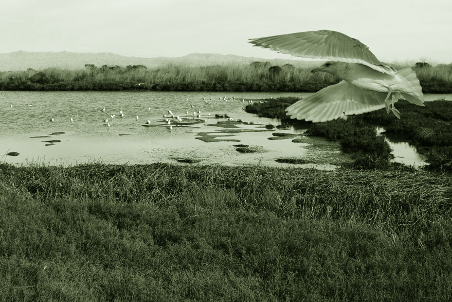
Using Text as a Clipping Mask


Pop Dots

3D Type with Repousse

Monday, May 16, 2011
surrealism

In my graphic, I used seven different elements, one background bitmap image of high mountain and country land, one sunset view, on top of which with another bitmap of egg yolk, and the 4th bitmap is the clouds in the sky flowing as a river. Then, I used my vector graphics of bananas and watermelons as sailboats, and added a couple of sliced star fruit as stars which both in bitmap and vector images.

Sunday, April 10, 2011
Mid-Term
 |
| Tower of London |
Tower of London was built by William the Conqueror to protect London and declare his power as well in 1078. It was expanded around the White Tower, which gives the entire castle its name, and was constructed through several phases under kings Henry III and Edward I in the 12th and 13th centuries. It has served variously as a royal palace, an armory, a private zoo, a home of the Royal Mint, a public records office, and so on. It was the home of the Crown Jewels of United Kingdom since 1303, which is a fascinating exhibition now in the museum. The Tower of London was regularly used as a prison since 1100, and the most famous prisoner to be at the Tower was Princess Elizabeth. She was there for eight weeks before she became Queen Elizabeth I in 1558.
The images I used to composite in this poster are William the Conqueror on the top left-hand corner, Elizabeth I on the bottom left, the Imperial Crown of India on the bottom center, two statues of armory on the bottom right, and the White Tower in the center.
Typography Graphic
 |
| edit with colored pencil effect |
I try the same photo with two different effects to create different atmosphere. The black and white one is creating an old look to express the Girl Scouts Motto has been existing for a long time. While the colored one with colored pencil effect brings the whole look to an art piece. The effect also adds texture on the image which really reminds me of a classical postcard.
 |
| edit with black and white |
Duotone
This assignment is called Duotone, so we have to composite two different sources or more into one two-tone image. The challenge part is making the selection nice and clean and choose the right image to make it believable.
Color Exercise
 |
Beautiful Mountain View This scenery was taken at a small mining village called Pin-Xi in Taiwan. It was a raining day when I visited; the color of trees, mountains, and grass were rather too dull. I imagined the scenery should be more colorful and beautiful if the light was right. Therefore, I tried my color exercise with it, brightened up the color and even exaggerated a bit more. The color scheme I used was Rectangle or tetradic color scheme, which includes four colors arranged into two complementary pairs. Here I used green and red as one complementary pair, and blue and orange as another. |
Subscribe to:
Comments (Atom)